
Apple Intelligence and Siri AI have sucked most of the oxygen out of the room at Apple’s Worldwide Developers Conference this year—understandable, maybe, given that the AI-powered Siri delays are all anyone has wanted to ask any Apple executive about for the last two years.
But Apple Intelligence is just one of the three big focus areas Apple outlined during its keynote this week. The second is new parental controls—overdue, but promising-looking, as the parent of a six-year-old with an iPad that I only begrudgingly connect to the Internet. And the third is “platform improvements,” a catch-all for a wide range of fit-and-finish changes aimed at boosting responsiveness and addressing common user complaints.
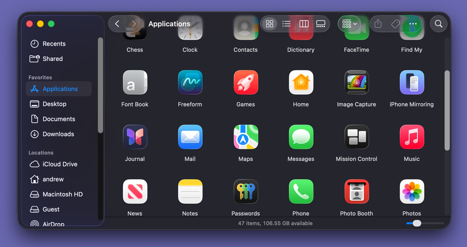
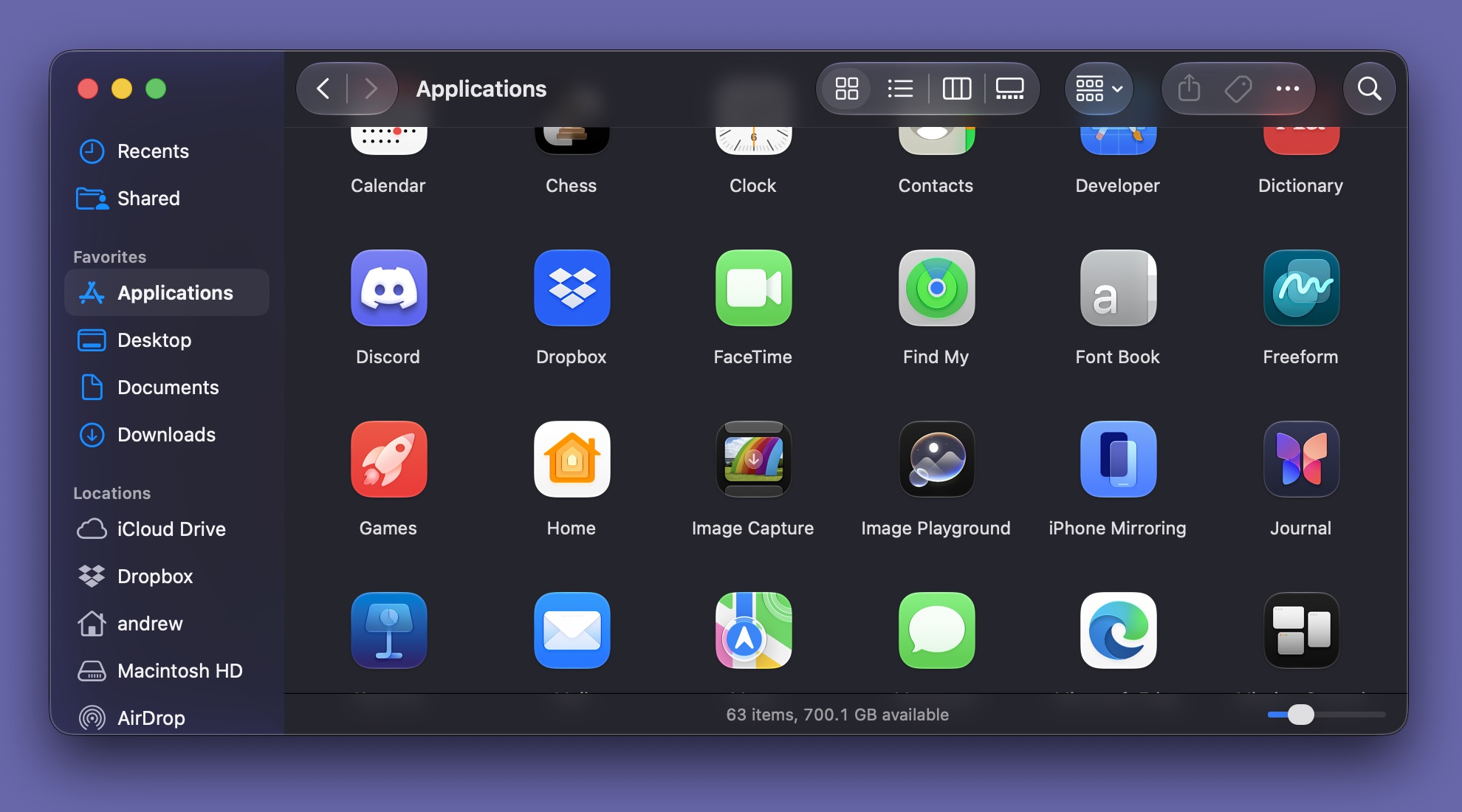
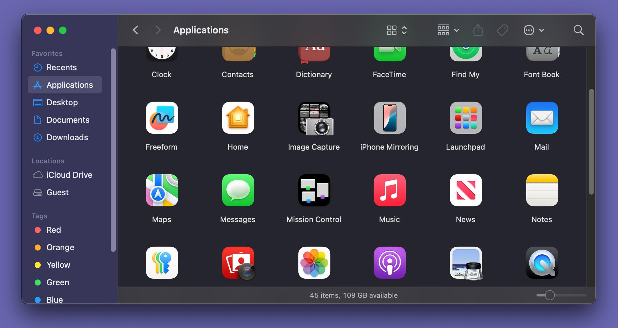
I have the first beta of macOS 27 Golden Gate running on an M1 MacBook Air—the oldest, slowest hardware Apple supports now that Intel compatibility is out the window. With some help from Apple’s densely packed wall-of-features slide, here are a few things from the “platform improvements” column I like the most, plus one item I’d still like to see.
Note that these are screenshots from an early beta and that things will continue to change as Apple releases more updates. Later betas, particularly those released after the public beta in July, will more closely resemble the finished version of the OS we get in the fall.
Liquid Glass and other UI changes
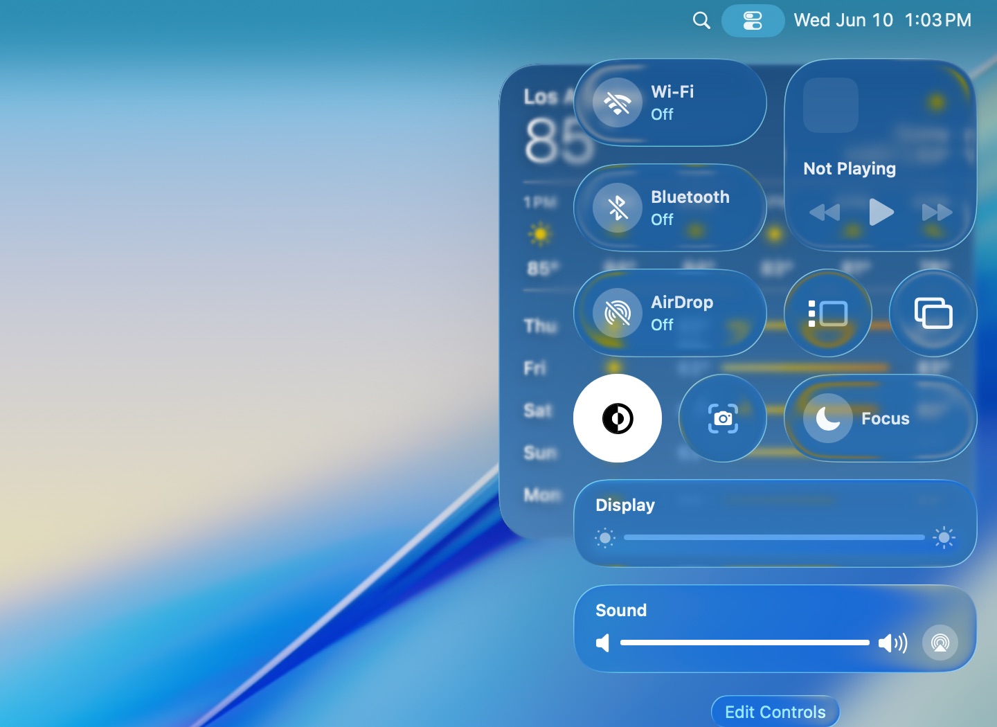
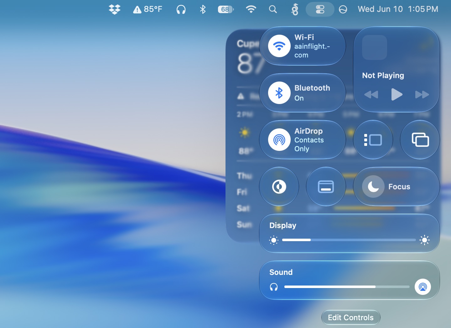

Apple doesn’t retreat from Liquid Glass in macOS Golden Gate, but it does tone down the effect in a few places while reverting to a more Big Sur-ish design in a couple of crucial areas.
The most prominent tweak is the slider in the Appearance settings that gives users fine-grained control over Liquid Glass’ opacity. This replaces the binary “Clear/Tinted” toggle that Apple added in the macOS 26.1 release, and it’s been added to the macOS setup flow so users can choose what they want when they upgrade their operating system or get a new Mac.
Liquid Glass’ baseline appearance has been improved a bit, too, even for people who push that slider all the way to the left for maximum glassiness. But as we covered in our Tahoe review, the Mac’s version of Liquid Glass was already much less glassy than the iOS version, and even the slider’s glassiest setting leaves notifications, menu bar menus, Spotlight searches, and most other things looking more tinted than glassy.
In the handful of places where Golden Gate does use glassier glass effect, including the Control Center and volume and screen brightness pop-ups, I can’t say I always find the tweaked light refraction to be an improvement. You still run into places where text overlaps other text, which is typically when Liquid Glass looks its worst. But at least now, people who are looking for maximum glassiness need to affirmatively choose it for themselves; the tinted view and the default halfway-between setting generally don’t cause as many problems.
Tahoe’s version of Liquid Glass allowed apps to use an optional “hard-style” divider for toolbar areas; in these cases, you could still see a clearly defined toolbar boundary, and the visibility of objects beneath the toolbar area was much less pronounced. In Golden Gate, the “hard-style” divider seems to be the only option. This helps resolve some of the readability issues we pointed out in our Tahoe review, such as when faded gray text is displayed over a photo with a lot of gray in it in the Photos app.
Though not directly related to Liquid Glass, Golden Gate also partially reverses other changes Tahoe made to the way windows and sidebars look and work. Sidebars now run from the edge of the window to the edge of the content area rather than in an extra layer of material that floats over the sidebar area. And window corners, while still more rounded than they were in the Big Sur-era design, are much less rounded than before. Crucially, this means that the place your cursor thinks the window corner starts and the place your eye thinks the corner starts are the same again.
Golden Gate also removes most of the little SF Symbols glyphs from next to menu items. As Daring Fireball’s John Gruber highlights, Apple’s updated Human Interface Guidelines for its new OSes now say that the Tahoe-era design is the wrong way to do it, and that icons for menu bar items should be used “sparingly and with purpose.”
I tend to think that most of the gripes about Tahoe and Liquid Glass were overblown, but Apple does seem to have addressed many of the specific, substantive criticisms I’ve either seen repeated by others or that I’ve made myself. Collectively, I suspect they’ll mostly satisfy the “I refuse to upgrade because of Liquid Glass” people.
External display support
Golden Gate makes a couple of changes to improve the Mac’s support for external displays. Most concretely, it’s adding native support for 5K ultrawide displays (Apple didn’t define an exact resolution, but panels like this Dell Ultrasharp model run at 5120 by 2160). This is likely to vary somewhat based on the Mac you’re using; M1, M2, and M3 series Macs that top out at 60 Hz on regular 16:9 5K monitors will probably still be capped at 60 Hz.
Appls also says Macs will do a better job of remembering how windows were positioned on multi-monitor displays, useful for laptop owners who regularly dock and undock their systems to one or more external displays.
Spruced-up menu bar icons
I like menu bar icons, and for the ones I interact with most often (particularly Bluetooth and audio controls), I prefer to keep them visible in the menu bar and save myself the trip to the Control Center.
There are two menu bar icon changes I’ve noticed and liked so far. First, there’s an icon that indicates when your Mac is connected to Ethernet. Before, only your Wi-Fi connectivity would show up in the menu bar. This is a small thing, but people want it often enough that third-party solutions exist.
The other is a redesigned battery icon. I always choose to display the charge percentage alongside the battery indicator, and that number is now nested inside the battery icon, as it is on modern iPhones. This saves precious menu bar space, allowing you to add an additional icon before you start running underneath your laptop’s display notch or crowding out the menu bar’s actual menus.
Virtualization changes
I may be more enthusiastic about Apple’s virtualization technology because virtual machines make writing sprawling macOS reviews much easier, but these improvements are also handy for developers testing across multiple macOS versions or anyone running an Arm version of Linux on top of macOS.
Two WWDC developer sessions outline the improvements coming for anyone trying to run an OS on top of another. One explained the changes coming to virtual machines, including the ability to create user accounts and configure features like auto-login and SSH during the VM setup rather than having to do it manually. You also get USB passthrough, support for “advanced network topologies,” disk-images sharing between VMs with the new DiskImageKit, and Virtio support.
If you use one of the handful of lightweight free-to-use virtualization apps that plug into Apple’s Virtualization framework (I like VirtualBuddy; UTM is also a good choice), you’ll need to wait for those apps to be updated before they support these features.
Apple has also introduced container machines in this year’s release, building on both the Virtualization framework and containerization features the company announced last year. This video explains how container machines allow users to run Linux on top of their Mac in a way that makes Linux feel like “an extension of macOS.” They provide seamless access to existing user files without the need to maintain a separate virtualized install as a traditional VM does, and they allow quick switching between running macOS and Linux commands.
A pile of little performance improvements
Many of the entries on Apple’s wall of features are about speeding things up a little, including in corners of the OS that most people interact with only occasionally. These entries include smoother Safari scrolling (among many other claimed Safari improvements), faster AirDrop discovery and file transfer performance, faster switching at the lock screen, faster user account creation, faster browsing for networked storage, and faster OCR for photos and documents.
Many of these things will be difficult to measure objectively, and I hesitate to draw too many conclusions from how the very first beta is running on a test MacBook Air (though so far, it’s been one of the more stable Beta 1 versions of macOS in recent memory—definitely much better than Tahoe was at the same time last year). But the intended effect is “less waiting on your computer,” and it will be a solid win if Apple can pull it off.
What I still want: Xcode’s new window tinting
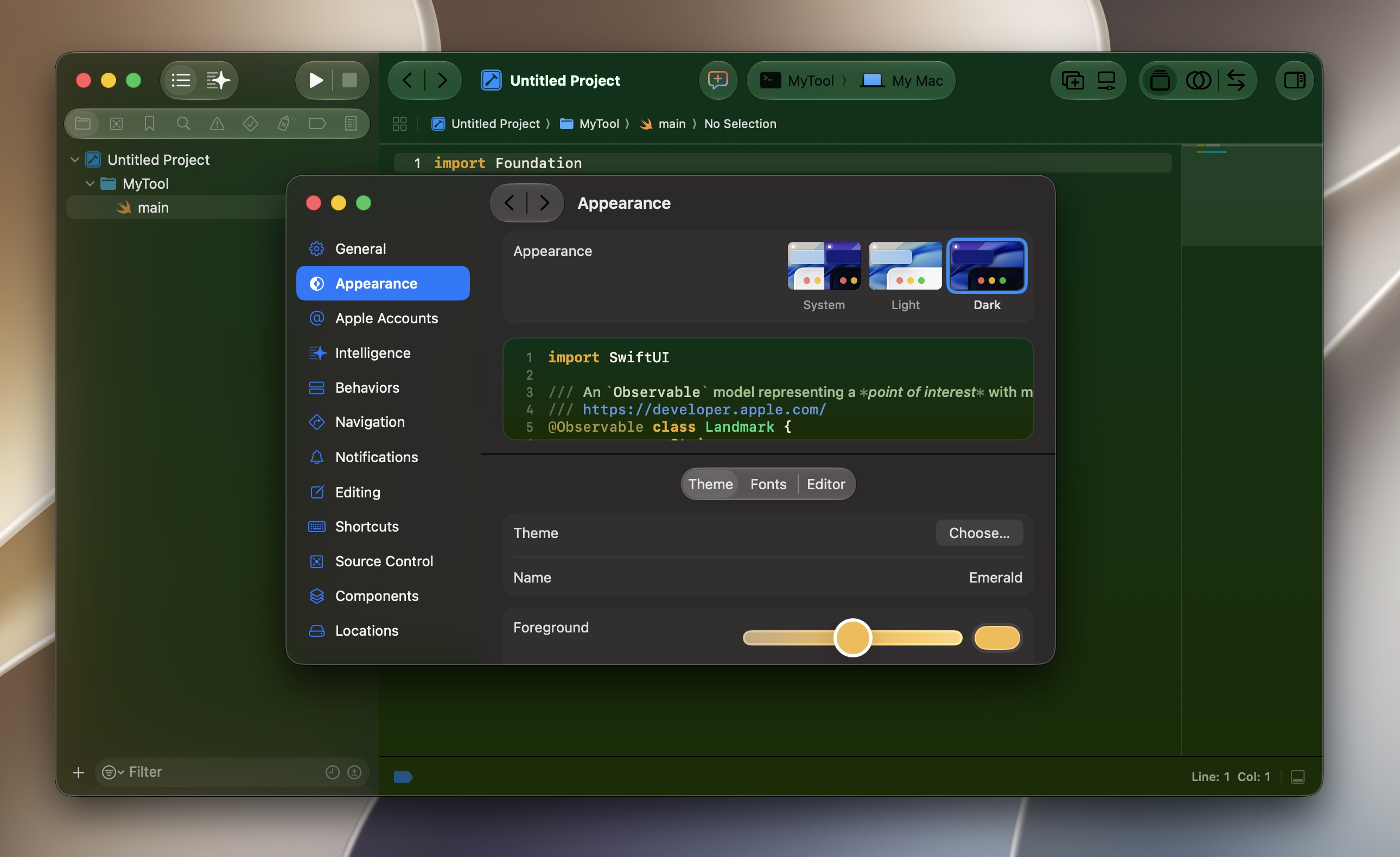
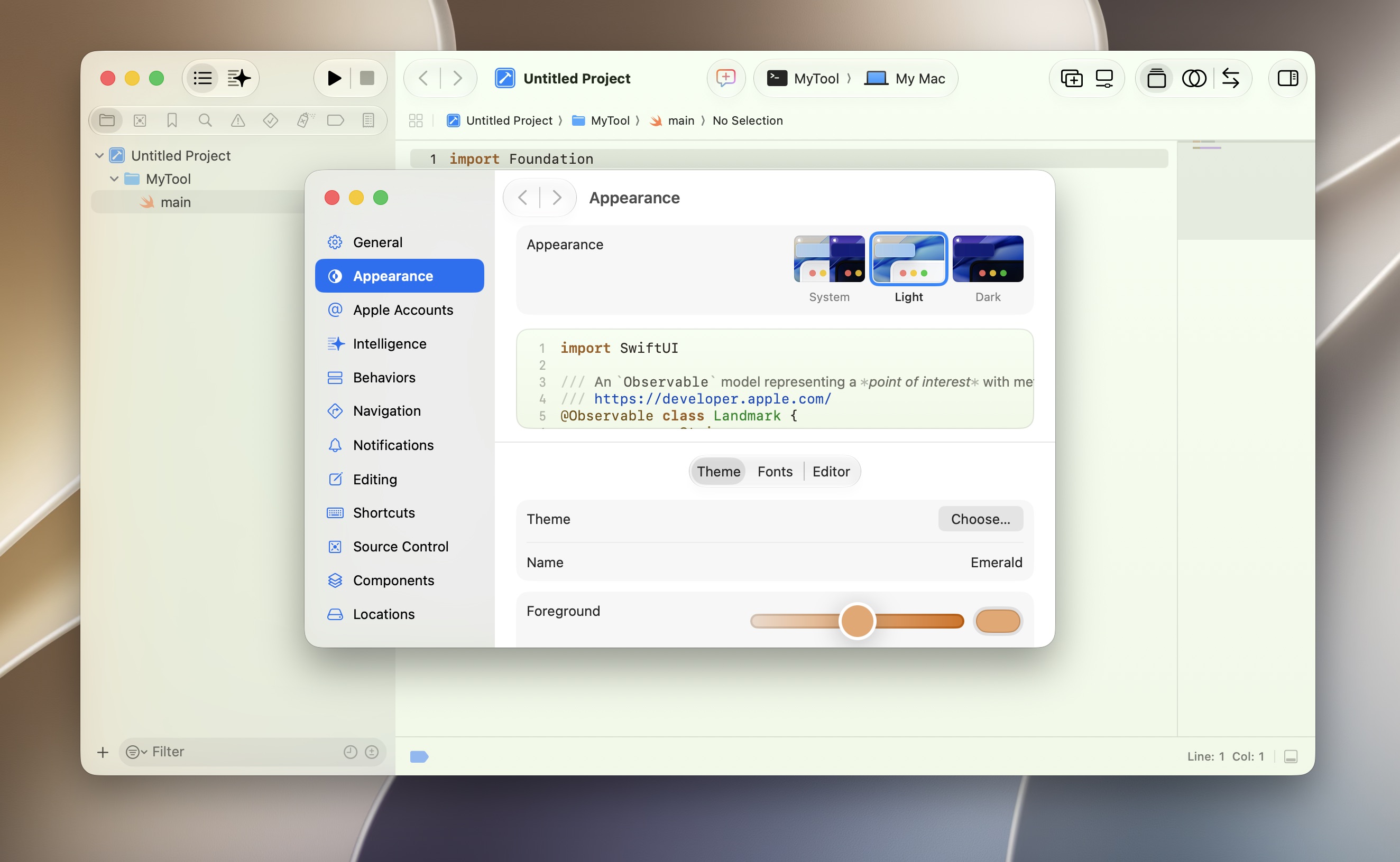
Xcode 27’s headlining new features mostly revolve around vibe coding. But there’s one new feature that isn’t directly about coding at all, and I’d like to see it implemented system-wide.
A new Appearance section in the Settings allows you to set a color theme independent of what you’re using in the rest of the OS—useful if you want to code in dark mode but prefer light mode for everything else, or vice-versa. On top of that, there’s a new “theme” setting that offers a bunch of color combinations to tint the Xcode window (and text and various highlights) in all kinds of colors.
This color is fully customizable and works for windows with both light and dark mode styling.
Of course, I could see this getting messy and exacerbating some of the readability issues people have had with the initial version of Liquid Glass. If you choose a green sidebar or toolbar icon for your app and the user sets their window to use the same shade of green, that’s a recipe for readability problems. But buttons and text in the OS can already change appearance based on the color that’s underneath them—extending that feature to support more flexible theming doesn’t seem like a huge leap.
I’m also not asking for quite the level of granularity seen in Xcode, where users can individually configure the colors of all kinds of OS elements, select different fonts, and even assign each project its own tint to differentiate it from the others. There’s such a thing as too many options, and the old Mac OS 9-era Appearance Manager gave users enough rope to hang themselves (aesthetically, I mean).
But even a limited list of window tint presets along the lines of the highlight colors Apple already offers feels like a logical next step for the company, a way to keep building on Tahoe’s icon customization options. Windows already pick up a tint automatically based on the content behind them! This would just be a way to let users choose their own persistent tint instead.


